Brand Positioning, Visual Identity, Graphic Language, Brand Communication • Year: 2016
About
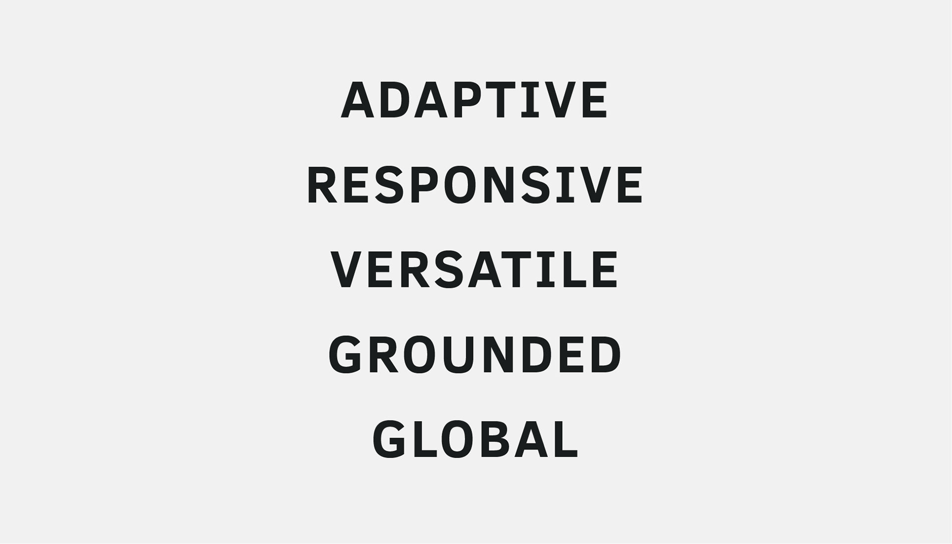
Systems Plus is a technology solution provider with more than 30 years of experience in the industry. The organisation caters to multiple sectors, of varying scales and different geographies. It’s working pillar-stones are efficiency, precision, agility, responsiveness, and adaptability.
Old Logo
Client Brief
1. The company wished to project itself as a global IT organisation as it worked with several international clients.
2. It wished to change the local perception of the company as a traditional IT firm
3. Attract good talent like the IT giants.
Concept Development
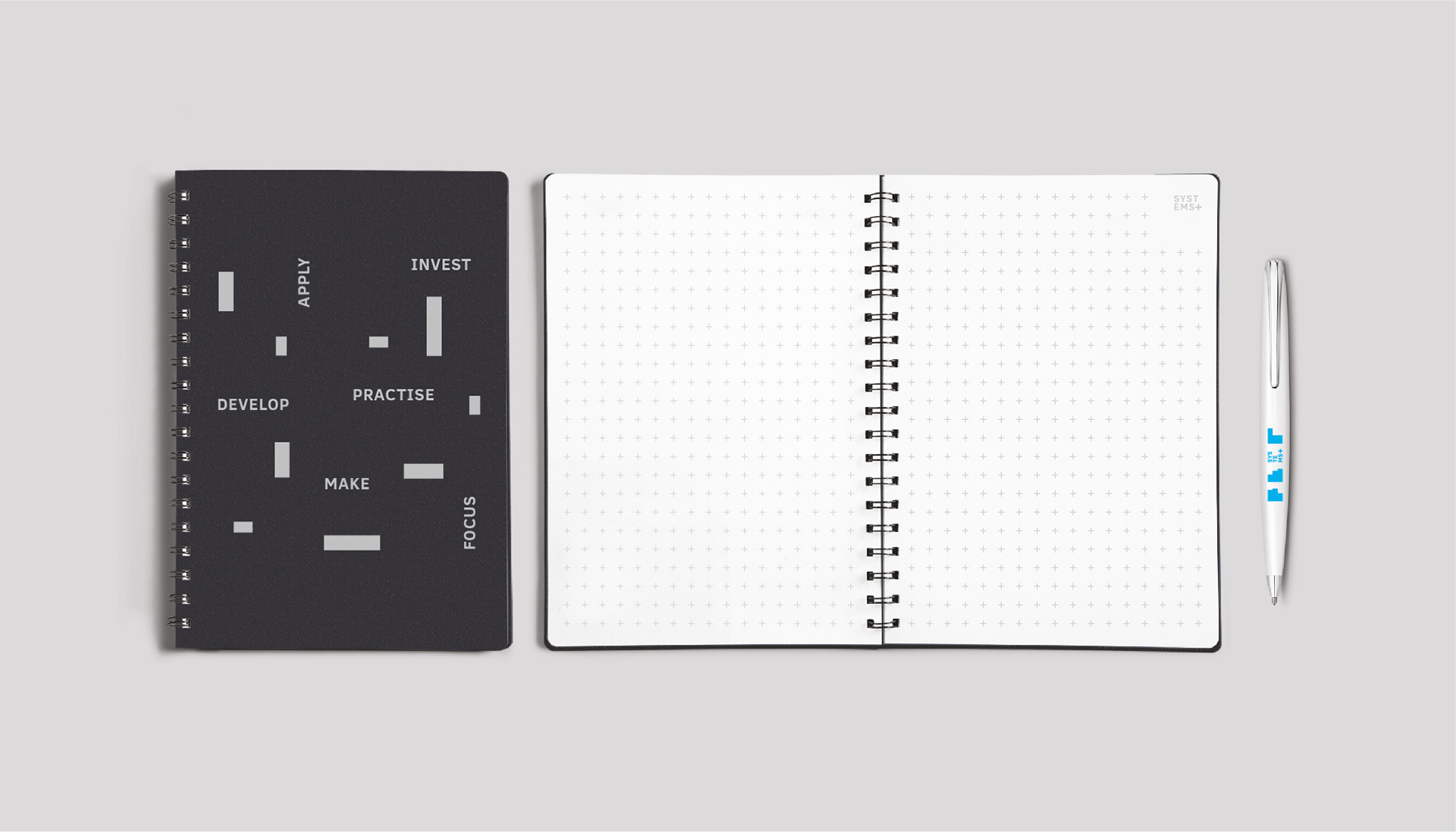
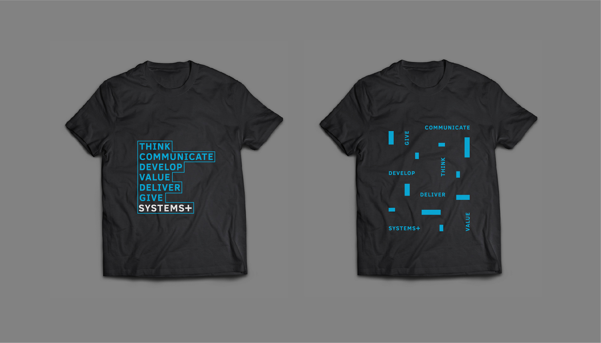
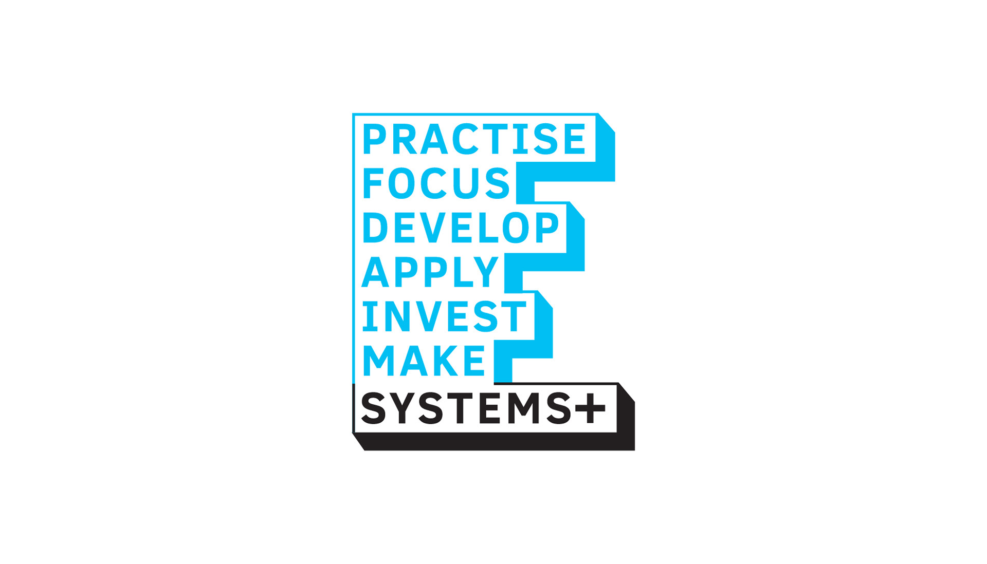
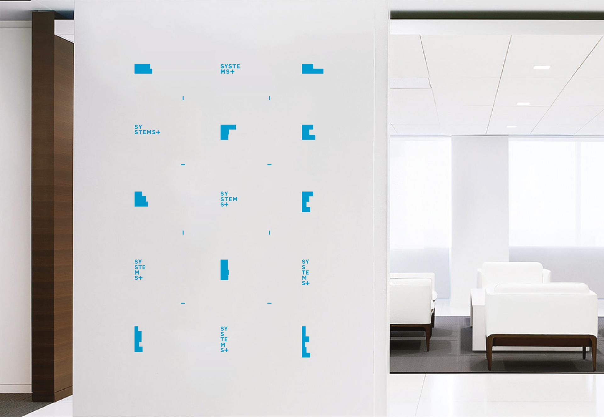
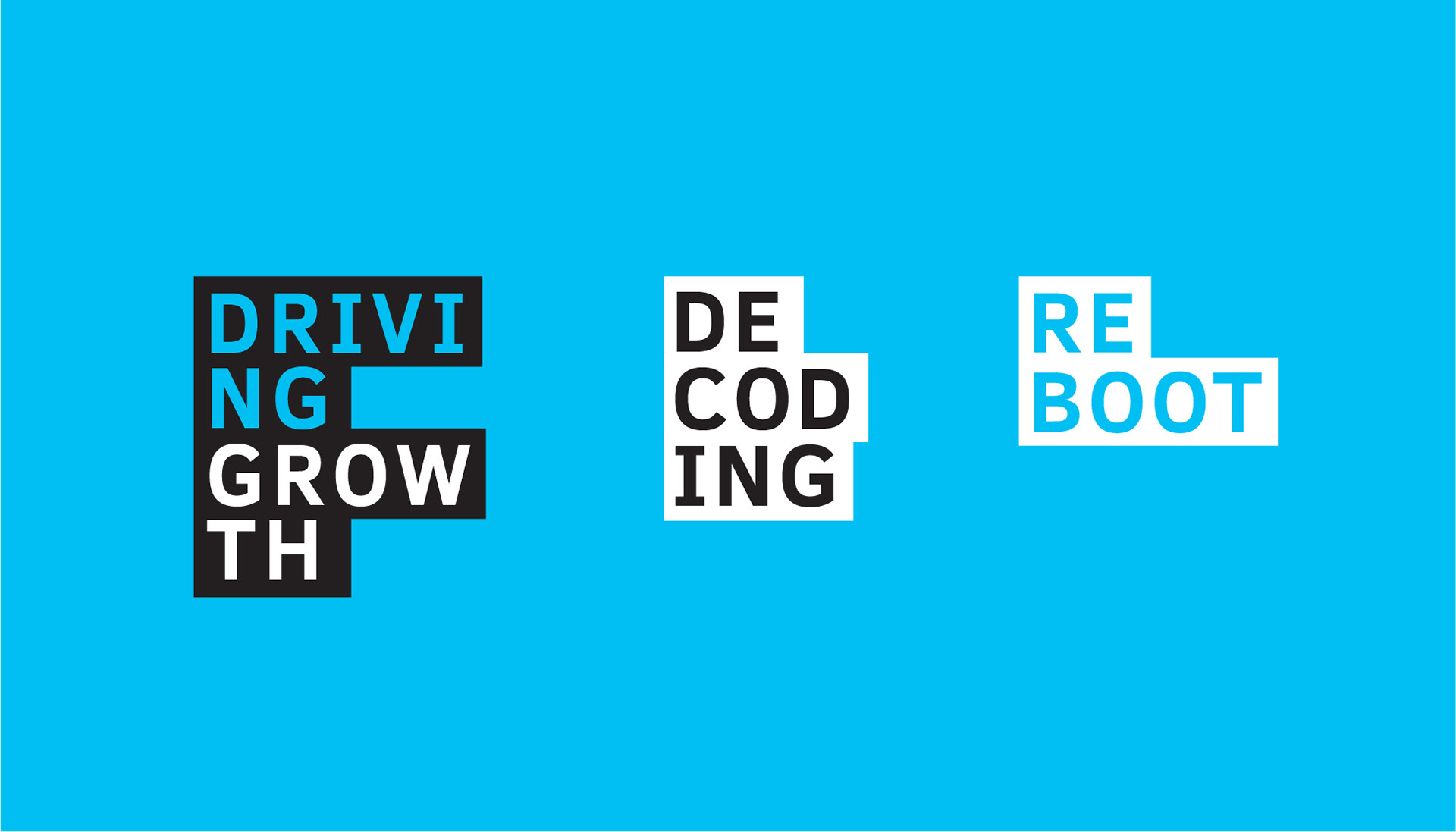
A typeface with attributes of simplicity, balance, modernity, and economy takes dynamic form to create the visual identity for SystemsPlus. The typeface appears in different configurations to communicate the organisation's ability to be nimble and agile by responding and re-structuring itself in a global economy inorder to become an integral part of the client they serve.

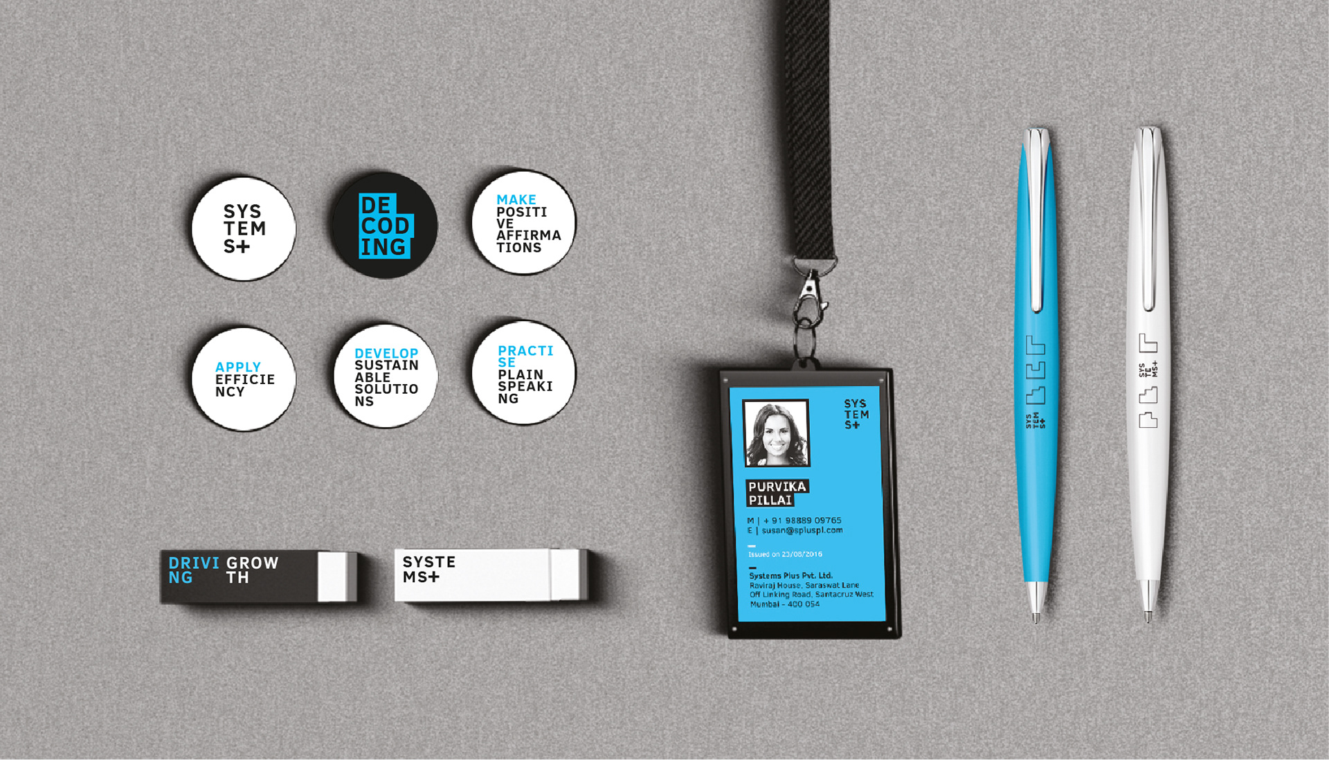
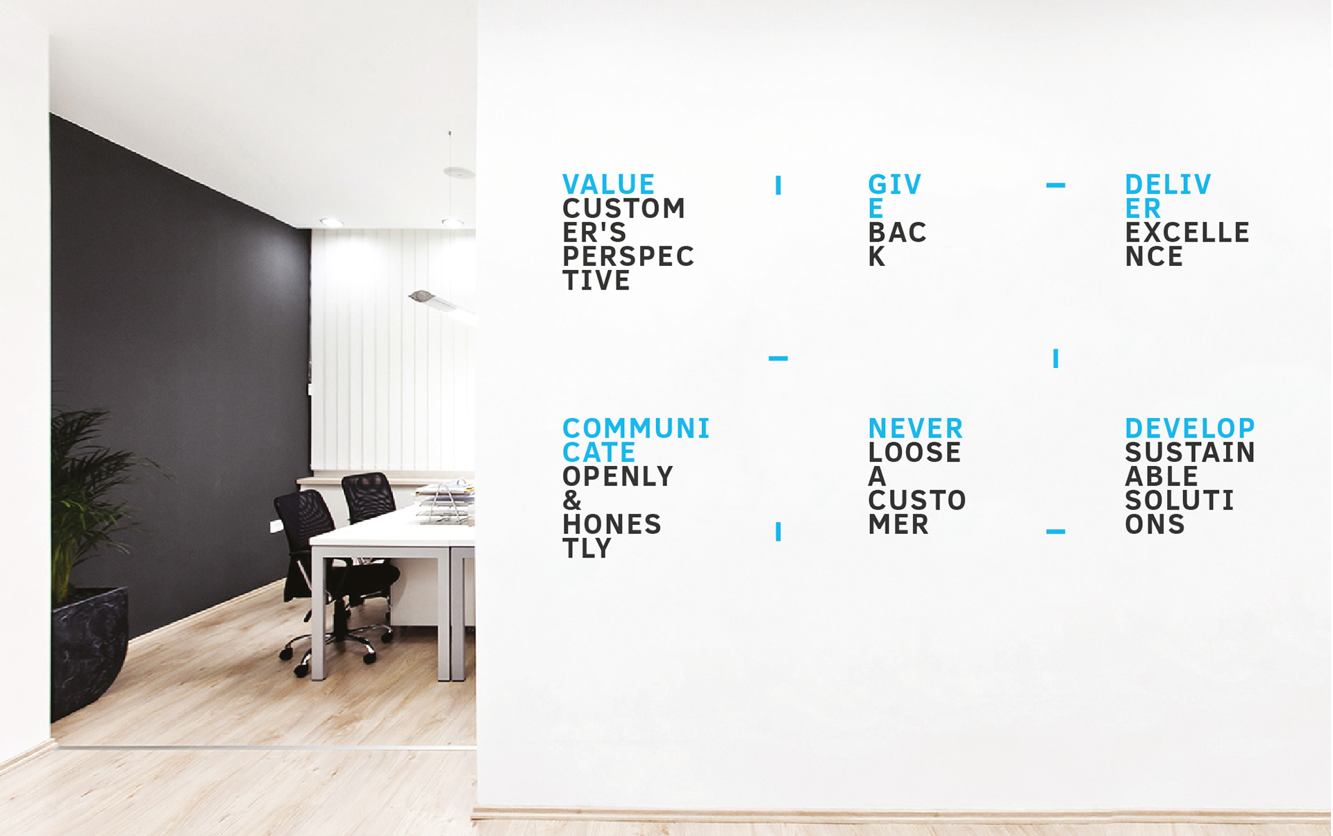
We initiated an employee engagement program where the employees of the company were asked to frame and submit the company's values based on the CEO's vision statement and their ambition for the company. The best ones were adopted in the brand's visual language.