Problem
For Air Quality products, Verkada customers got accurate readings (data) from a device on real-time and past anomalies on set thresholds (called events), such as high vape index, high temperature, high humidity etc. But there was no data available to them on the number of events that were triggered across the devices in their org and sites for various timeframes like day, week, month.
Analytical data was important for the customers to gain insight on the severity, frequency and location of the problem. It would also help customers measure impact for a solution, and check if the events reduced or increased over time.
Project Goal
Enable 'Organization Admins' to compare and visualize trends for Air Quality events across various timeframes in their organization
Product Requirement based on User Needs
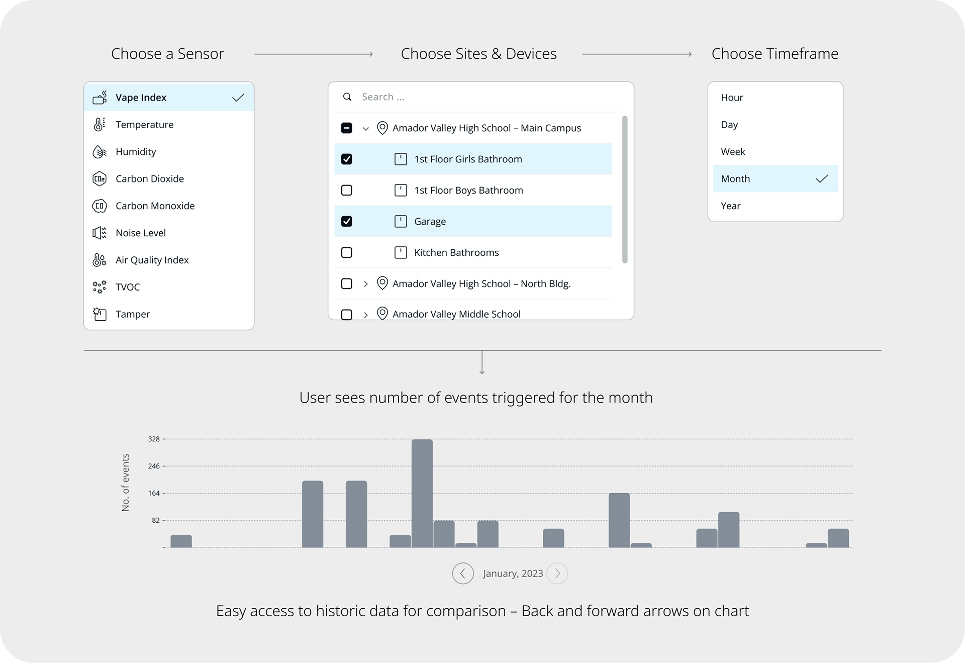
Enable users to view and investigate:
Which months, weeks, days and hours the events are highest
Where are the highest number of events detected – which sites and devices
What is the change in event trends over a timeframe – increase or decrease
Page Components & Quick Explorations
Concept 1: Chart view of one day/ week/ month/ year
Each bar represents smallest unit of the selected timeframe
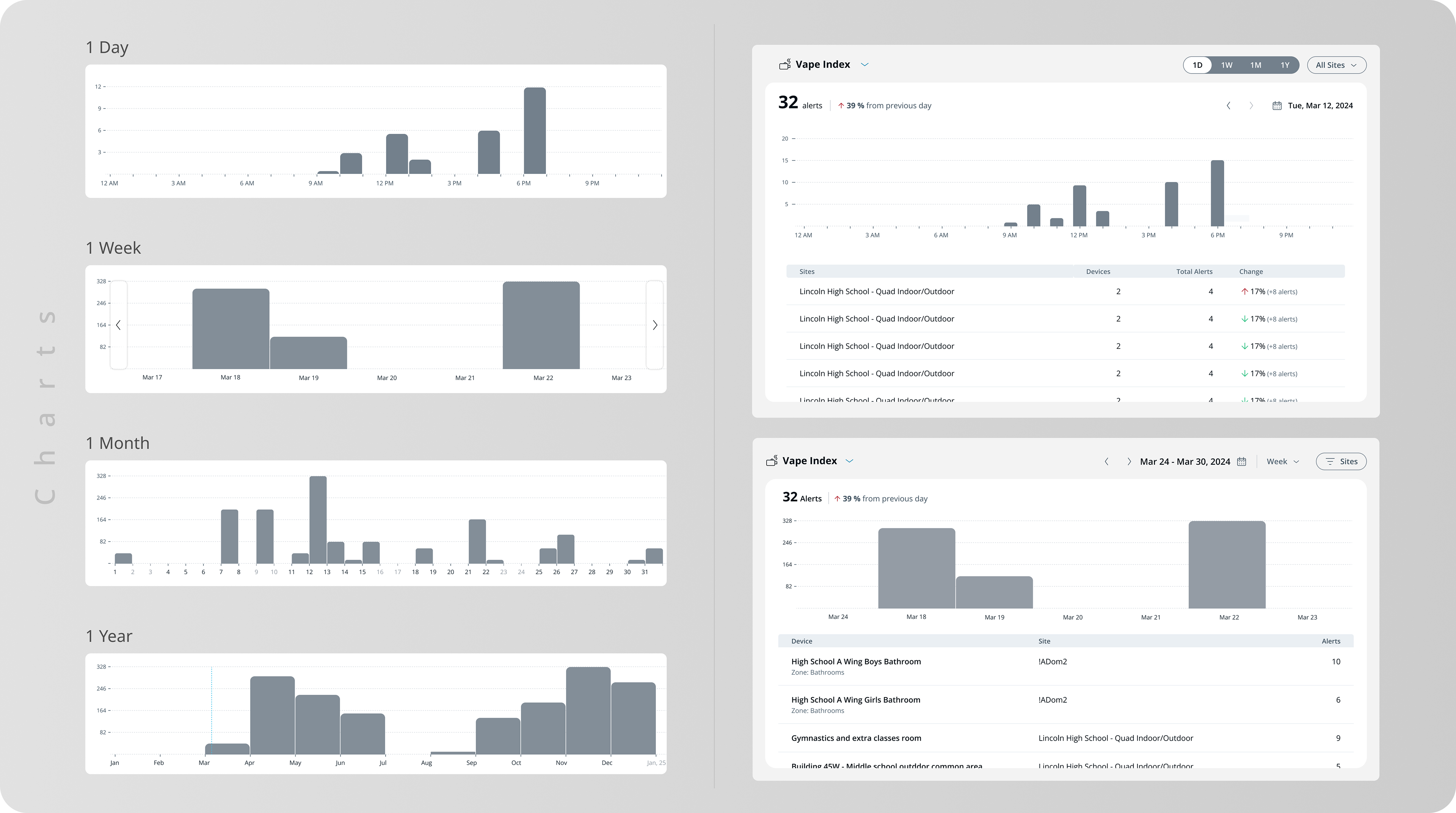
❌ Feedback from 4 customers – Not intuitive enough to compare one day, month or week to another
❌ Varying x-axis increments for each timeframe resulting in inconsistent bar widths and high cognitive load
❌ Transition animations from one timeframe to another are drastic and clunky
❌ A heavy lift from eng to build 4 different charts
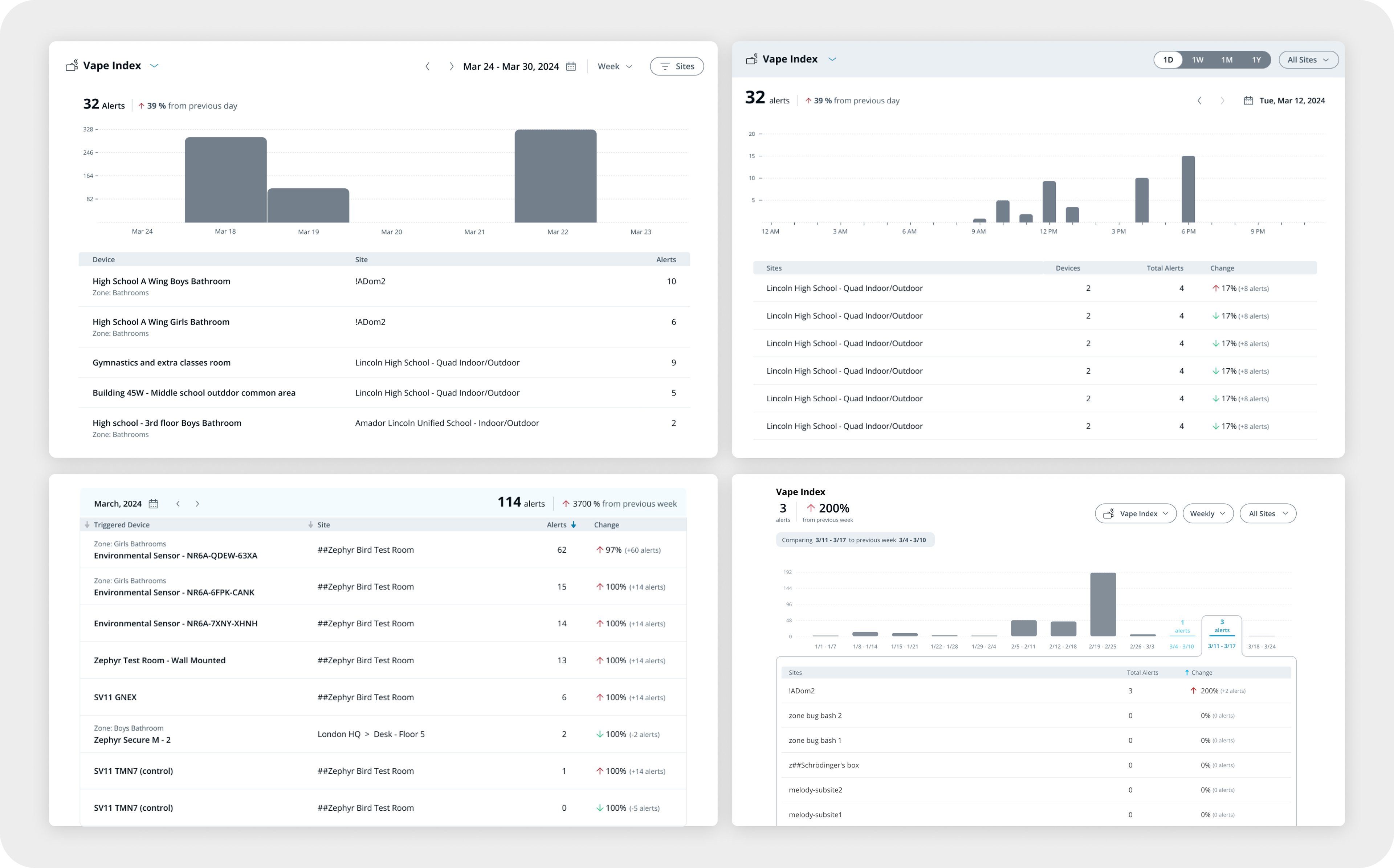
Concept 2: Chart view of hourly/ daily/ weekly/ monthly
Each bar = 1 hour/ day/ week/ month

✅ Easy to compare one day, month or week to another
✅ Consistent x-axis increments and bar widths for every timeframe
✅ Smooth transitions from one timeframe to another
✅ Smaller lift from eng to build a consistent chart UI
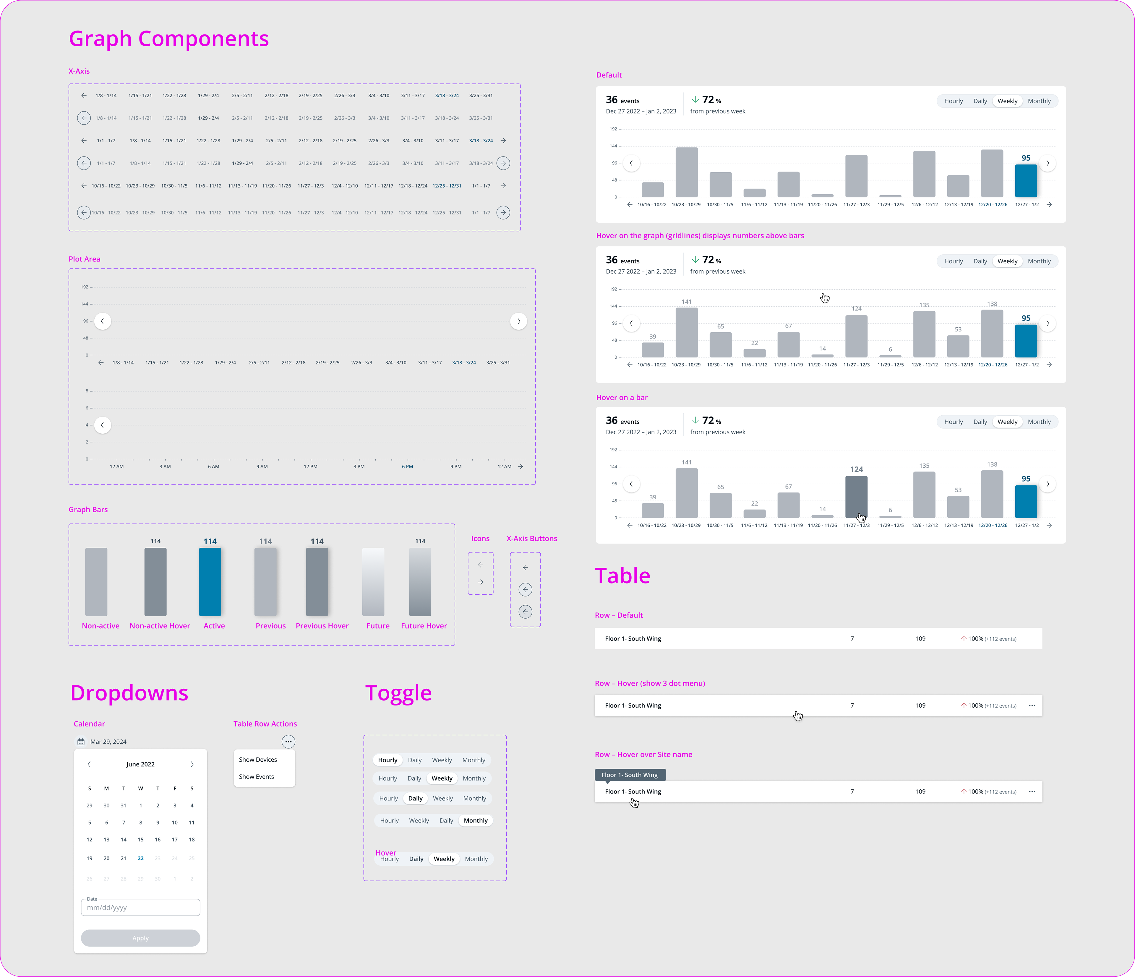
Hi Fidelity Prototype for Eng team
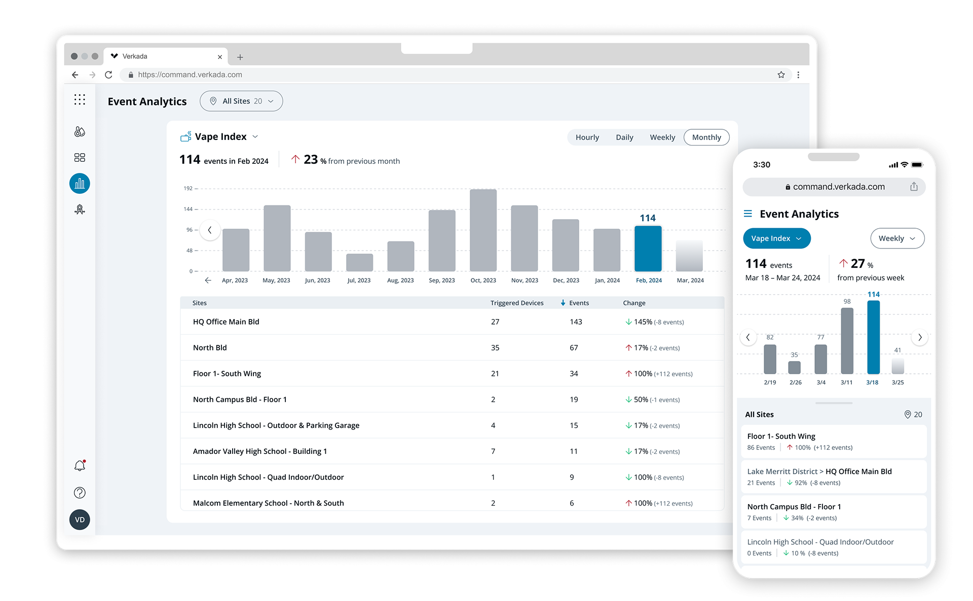
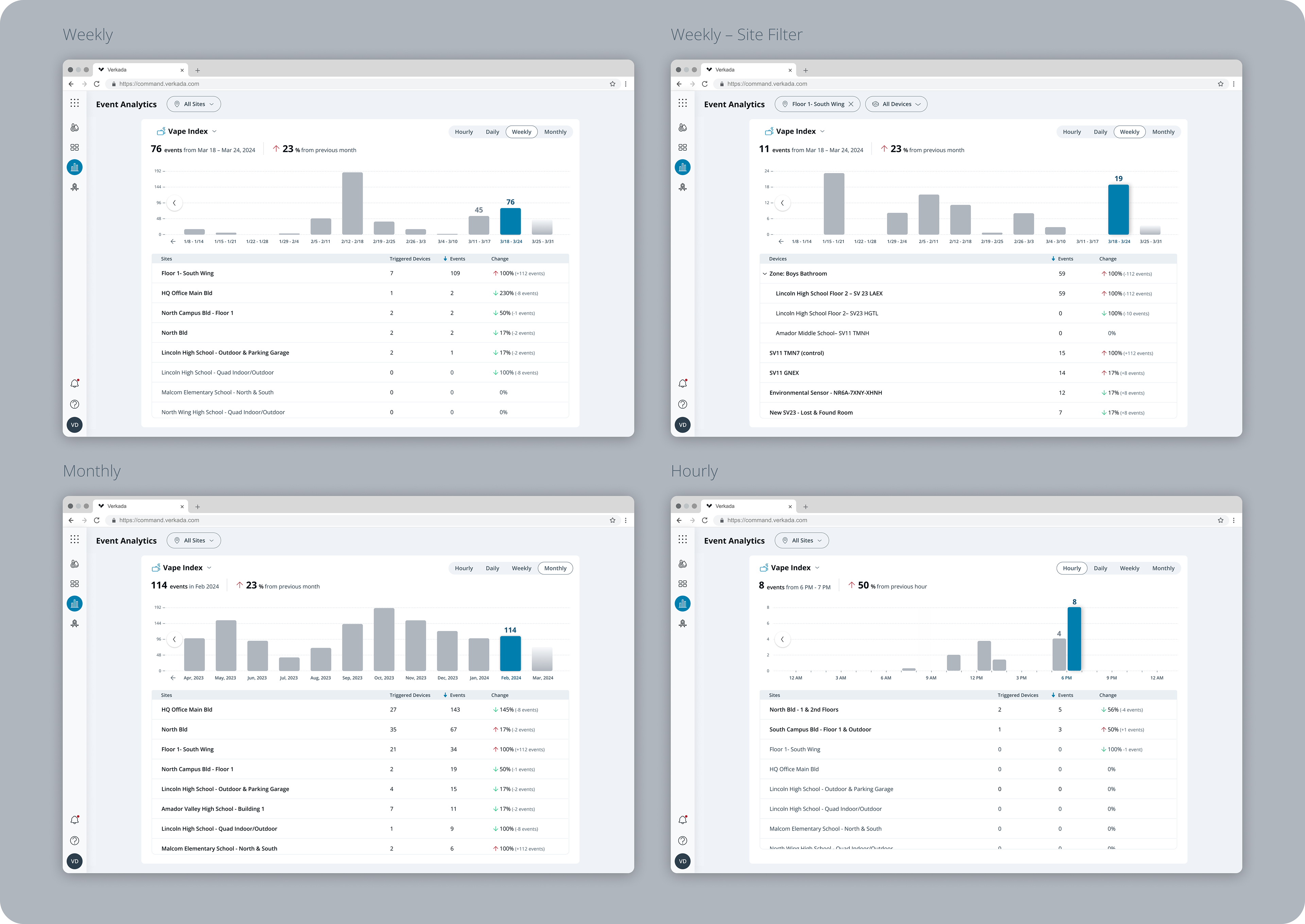
Final Design - Desktop
Tweaks were made in the visual design before release– We work closely and iterate a lot
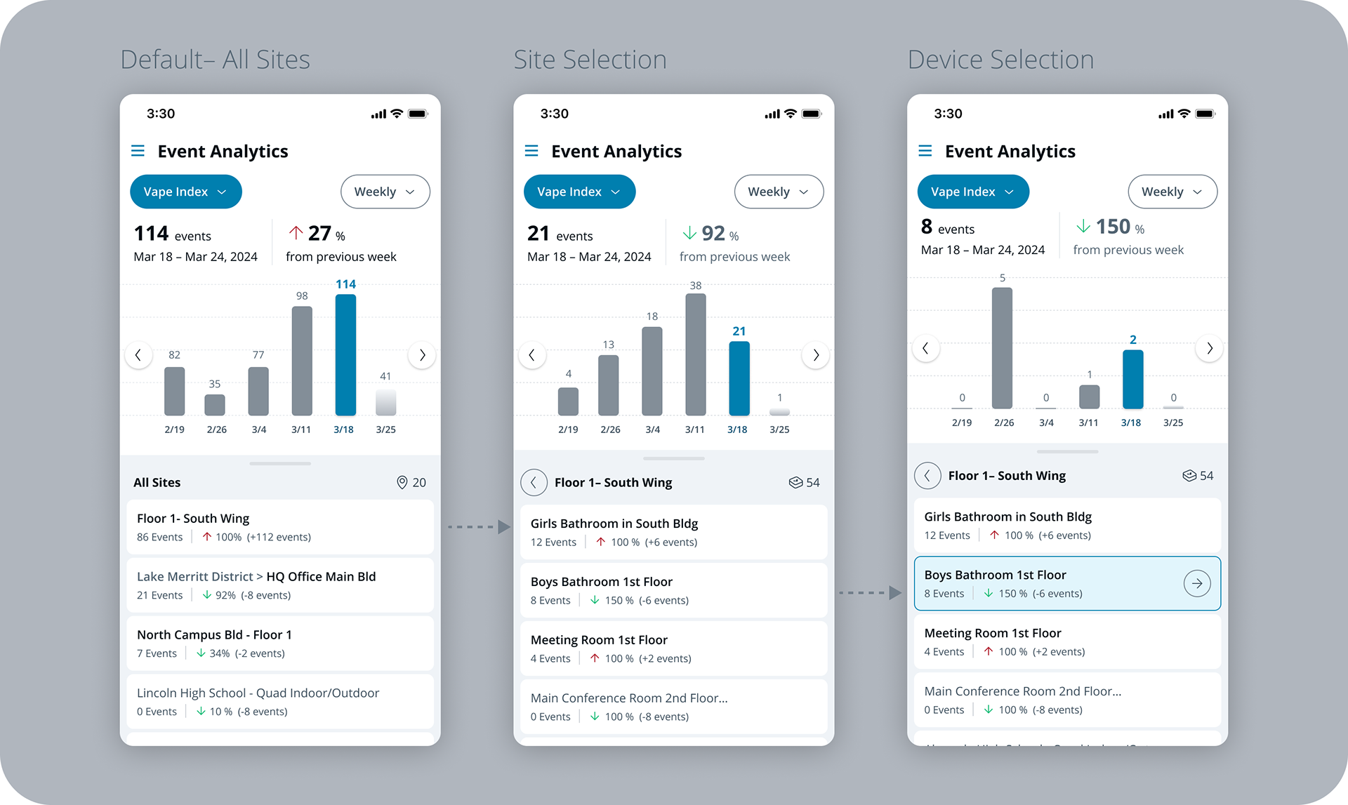
Final Design - Mobile
Key Components for Eng
💰 Result
Our Solutions Engineering and Account Executives team reported that this page was most impactful in driving sales as it shows the value and impact of the Air Quality product with proven ROI. Our existing 'SLED' customers were supportive and happy to share their Event Analytics page data that showed the reduction in Vape events over time after installing Verkada Air Quality products in their campus to potential customers.